Oll Korrect is one of my largest projects where I created a full package style guide for a startup company.
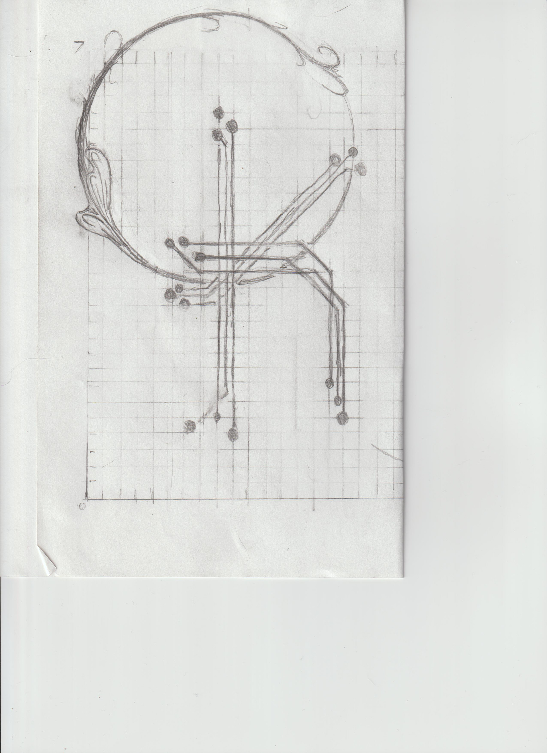

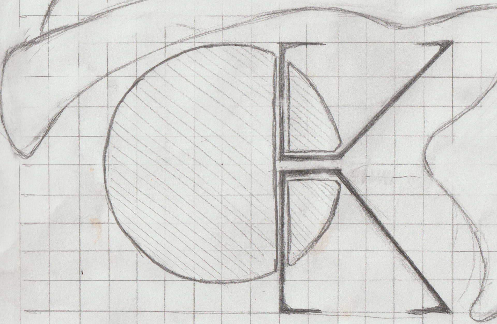
these were two samples of the roughs that I completed before out first meeting. The designs centered around the idea of frame and subject. I was looking to combine aspect of Art Nouveau and Silicon Valley Minimalism to create a feeling of humanism interwoven with technology. I also liked the parallels between the vines of Art Nouveau and the lines in a depiction of network connections.
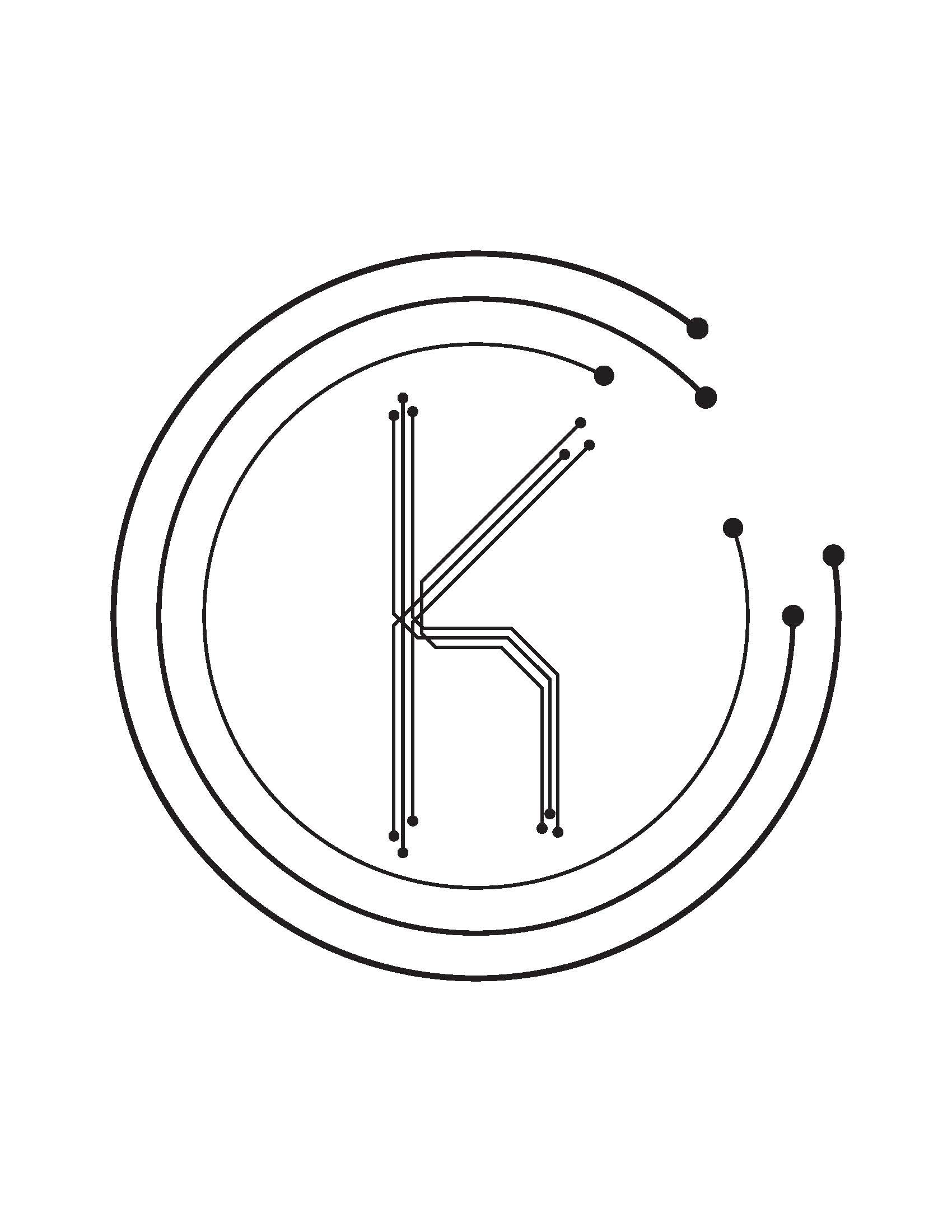

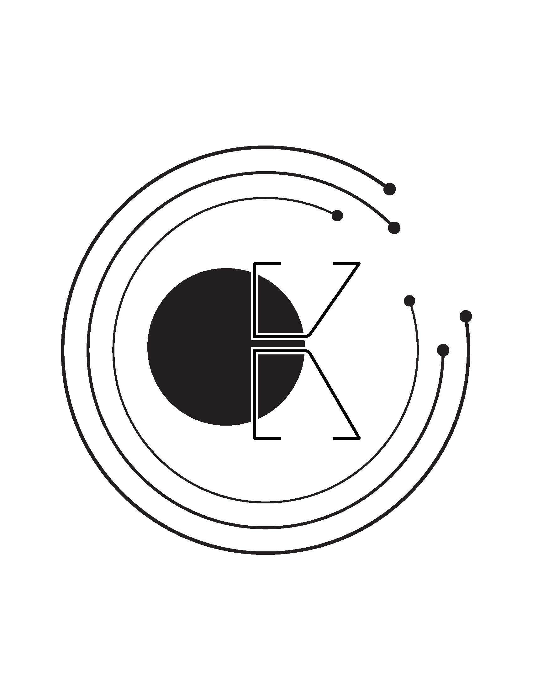

My client enjoyed the more contemporary Silicon Valley Minimalist style, but wanted to see variations upon the design that used three circle. With that design we also decided to focus on the idea of movement in hopes to include animated graphics in the future.
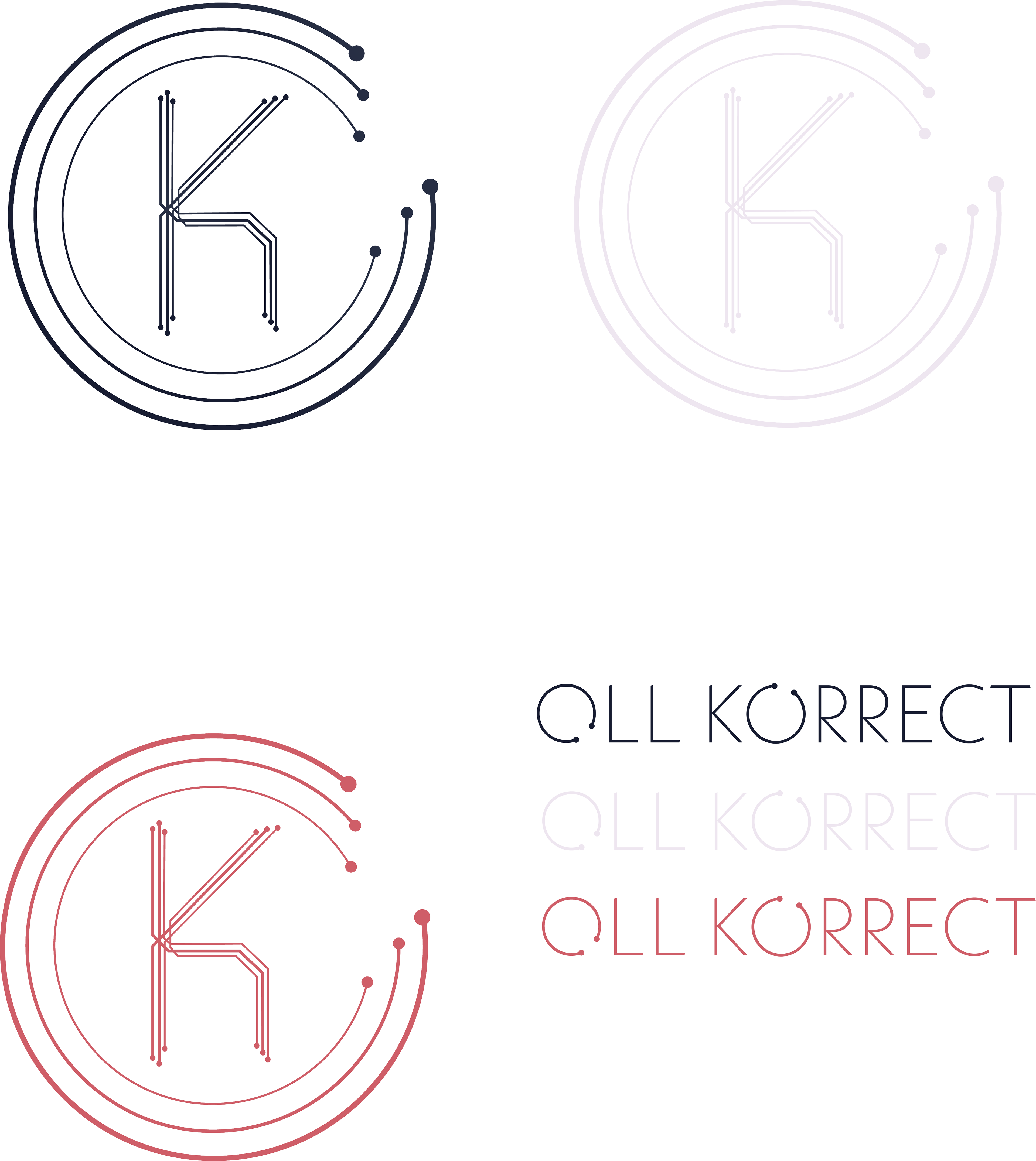
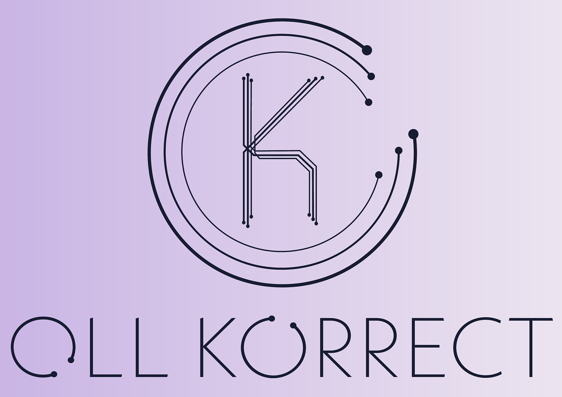
We finalized on this design with a range of colour options for it. The company decided to use a variation of Neue Kabel Extra Light for their company name.

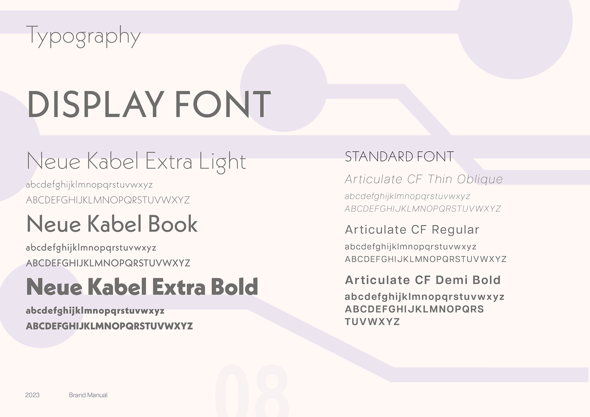

The goal throughout was to create a package that displayed an interesting layout with dynamic colours. The colour palette was designed to be new, exciting, and different. with two colours that were analogous to allow for interesting non distracting colour combinations, and then a secondary palette that was bright and popped. The fonts were chosen to be eloquent, new, dynamic, and interesting. Everything was designed to look mirror the logo design while providing an interesting layout.

As one of my first large and high profile projects I am incredibly proud of how it turned out.