
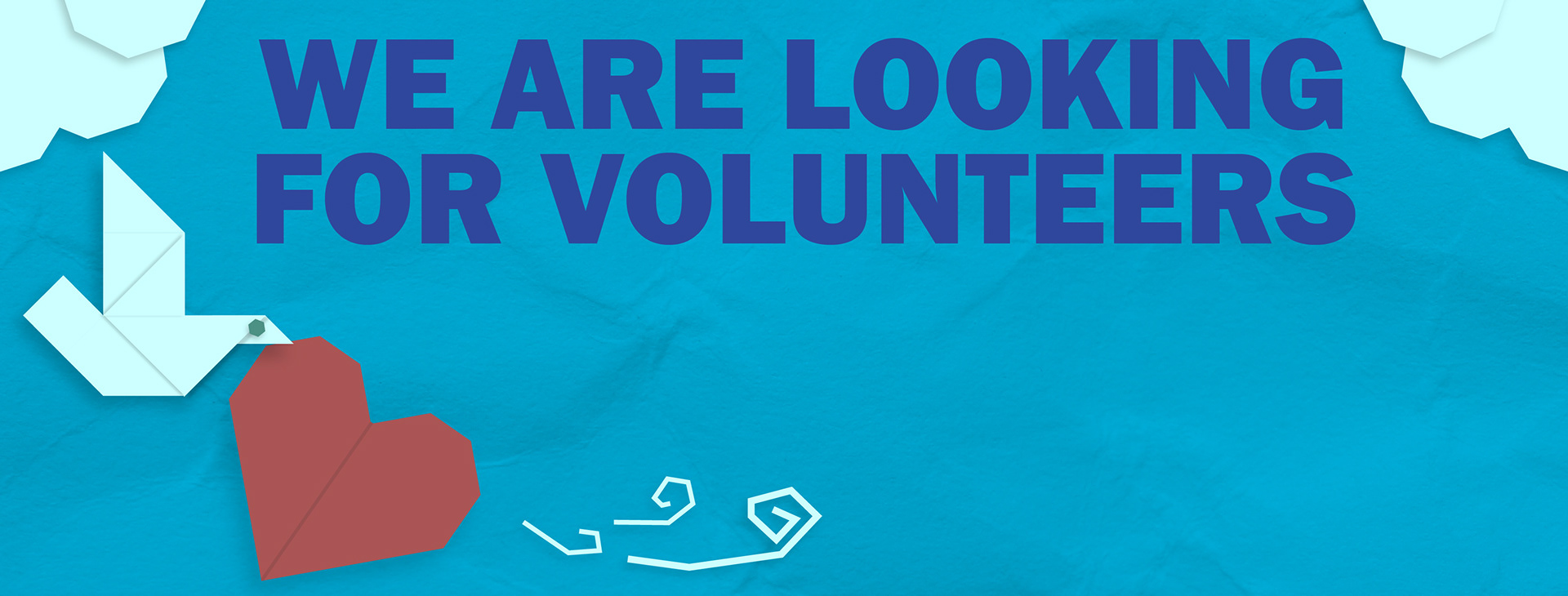
During my time with Parkinson Association of Alberta I had the opportunity to make multiple different graphic elements spanning from website carousels to email advertisements. When I first started, the designs I made leaned a little too closely to a safe corporatized imagery. This felt too cold and unwelcoming for the brand, and so I expanded a little more. I noticed that my contract lead was excited by designs that were playful, cute, and warm, but still wanted a professional aspect. For each Item, I took different approaches based on the context of their publication. One of the biggest success was the project I made for their Volunteer call-outs. My contract lead wanted a template design where they could just enter the volunteer positions that they were looking for. I wanted to capture something unique, so I used a cut paper style that implemented their brand colours and would stand out. This style emphasized that idea of play and fun as a means of providing a hook for those who might be interested in volunteering.
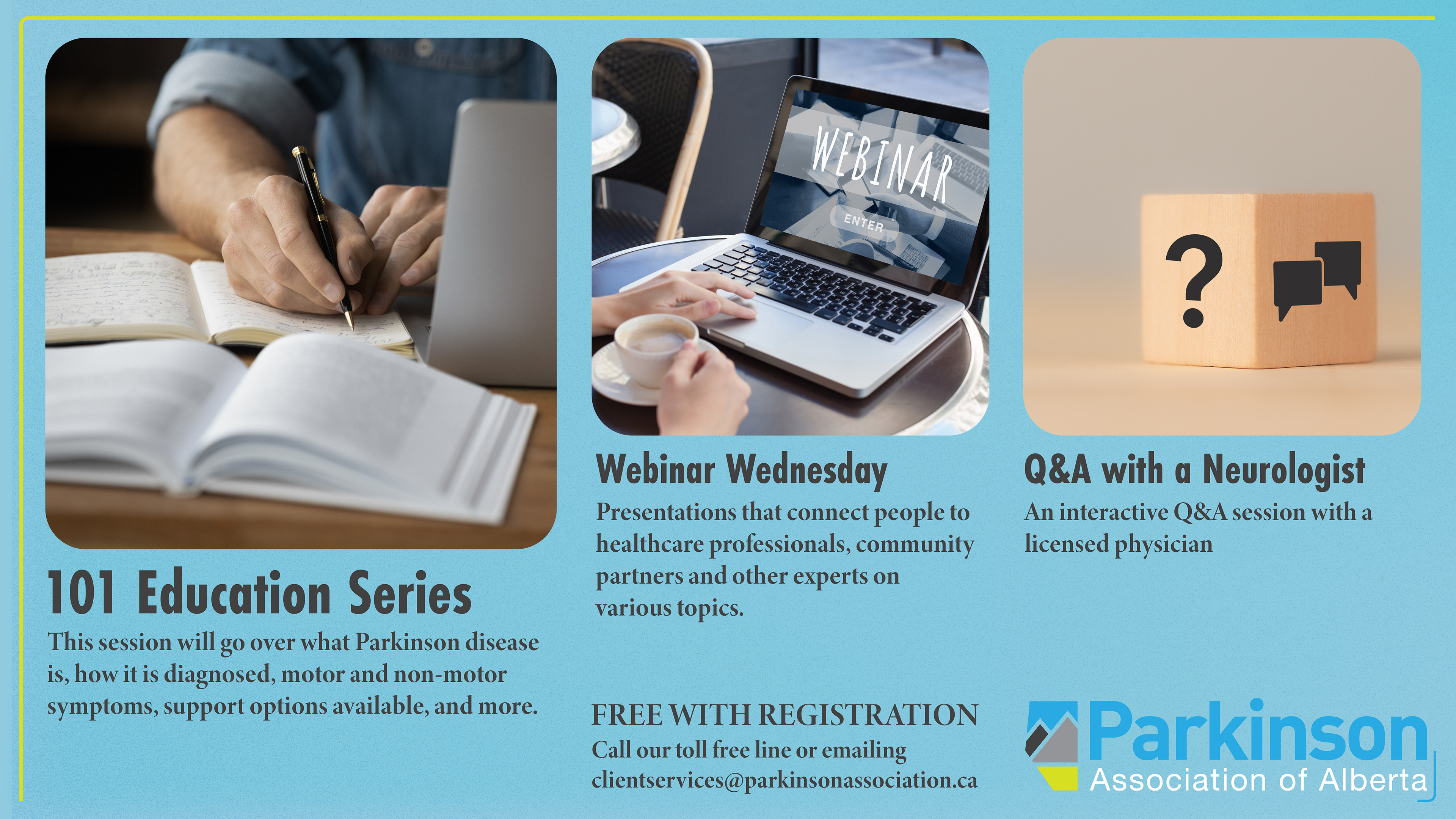

Parkinson Association of Alberta wanted to have a graphic that could be used and present by their various partners to display their offer programs. For this project I used a very conventional display with a slight frame to provide structure, and texture to make it visually unique. In a similar vein, I created advertisements for their Wellness Retreat that took a standard approach to ensure clear communication on a very popular event.


All these graphic elements helped reinforce Parkinson Association of Alberta Central values of Creativity and compassion. Their softness an playfulness conveys a message of open transparency and kindness all while remaining visually distinct.